BRAND GUIDELINES
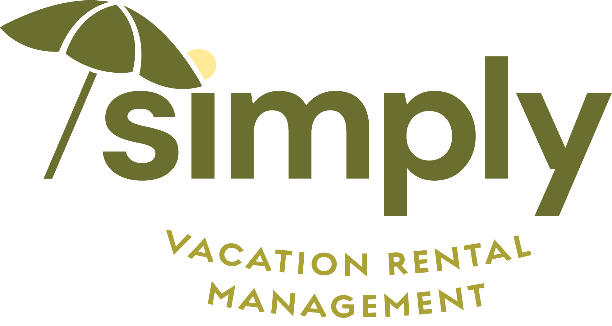
Simply
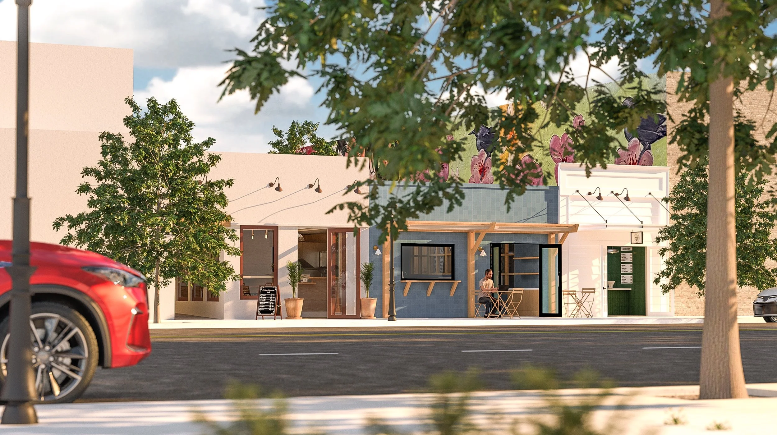
Vacation Rental Management
Brand Identity
Simply’s brand identity features a logo and wordmark that are designed strategically to function in a variety of lockups.
The primary logo motif is a slanted shade umbrella with an afternoon sun peaking out from behind, to evoke not only the idea of sunny days spent vacationing, but also the concepts of comfort, coverage, and protection, all of which will be felt by customers choosing to engage in Simply’s services.
Complementing this distinctive logo is a bold sans serif typeface, symbolizing a modern and youthful approach to running a vacation rental management business.
The subheading descriptor of “Vacation Rental Management” is placed along a curving baseline, not only to add to the playfulness of the brand identity, but to evoke themes of smiling and relaxing – essentially a hammock of text.
Two additional “Easter eggs” emerge when the logo is positioned to be immediately to the left of the wordmark, – the sun in the logo can now double as the dot of the “i” in Simply, and the slant of the umbrella hearkens to a forward slash in a line of code, subtly implying a tech-savviness in the way Simply does business.
For the browser favicon, the sun umbrella in Cloud and afternoon sun in Citrus are to be used against the Moss background.
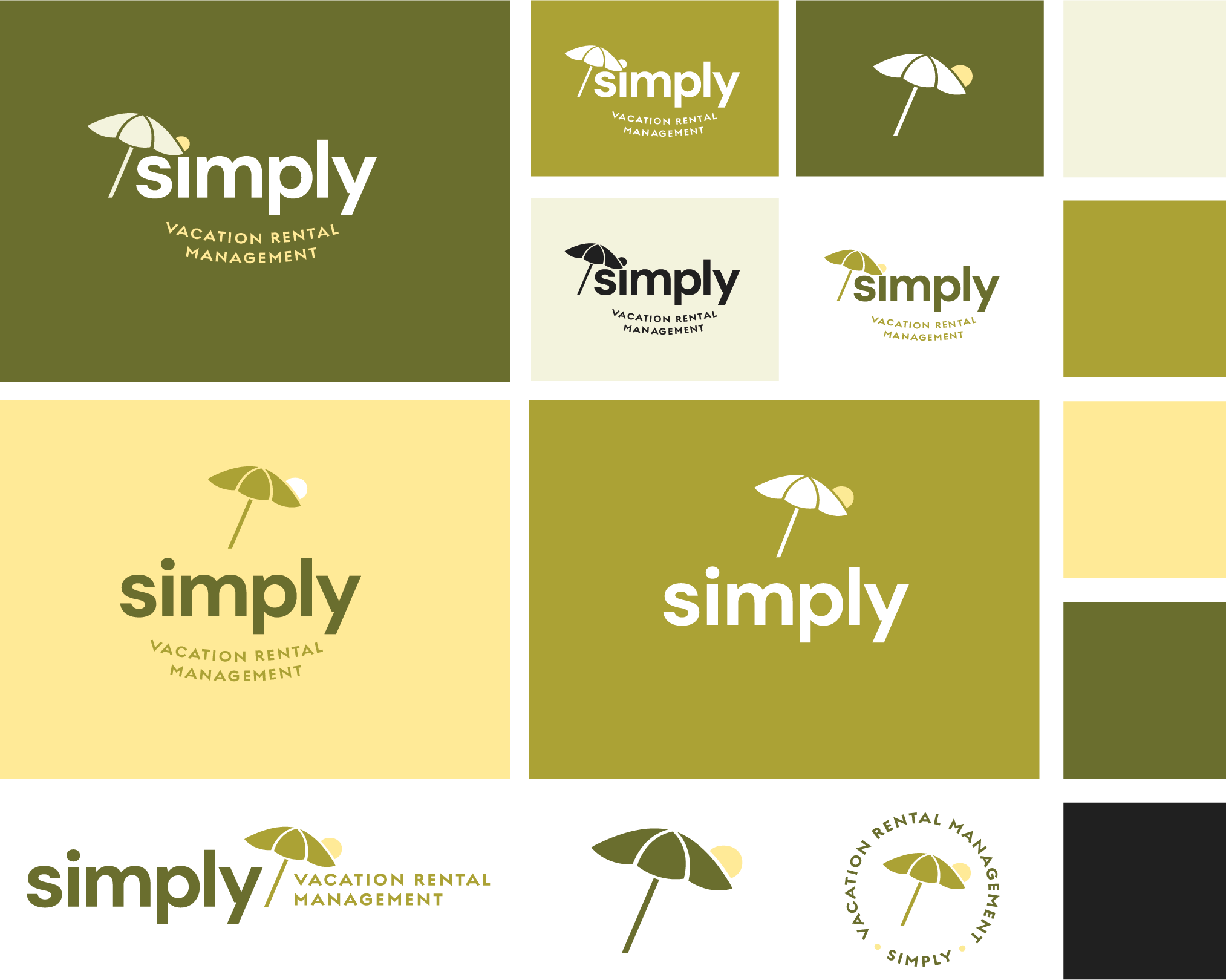
Color Palette
Simply’s color palette is inspired by the natural hues found in vacation destinations. Cloud and Mojito serve as light swatch background colors, conveying levity and airiness.
Palm and Moss, representing varying shades of foliage, are the dark swatch background colors, adding playfulness and life to the brand feel.
Citrus serves as a tertiary accent color meant to be used strategically to give pops of color throughout brand collateral.
Volcano, as an alternative to true black, brings a muted, printed feel to heading and subheading text on light backgrounds.

Typography
Simply’s brand embraces a youthful and modern typographic approach by utilizing DM Sans Bold in all-lowercase for headings, Regulator Nova Demi Bold in all caps for subheadings, and lighter wieghts of Regulator Nova as approriate for body copy across its digital and print materials. This clean typeface imparts a quality of relevance to the brand's messaging.
All primary headings are to be rendered with standard casing with a preference for incomplete clauses followed by periods for an informal and casual feel, and where appropriate, words and phrases can be highlighted by alternating to other colors in the brand palette.


Brand Collateral
Simply’s color palette is to be used across all brand collateral except where natural materials such as hemp, burlap, canvas, or brown craft paper are appropriate. Moss is to serve as the base color for windbreakers and hats, while Cloud is to function as the base color for T-shirts.
If desired, white-labeled product can be used as leave-behind promotional collateral at Simply’s customer’s properties, with items strategically chosen to lean into the theme of vacationing and exotic destinations, such as coffee beans, sunscreen, and woven tote bags.

Brand Voice
Simply's brand voice emphasizes themes of rest, vacation, and youthful playfulness, while still seeking to give reassurance to the customer that they’ll be receiving high-quality service with a personalized feel.
The overall idea is “Let us manage your vacation rental, so yo yourself can actually vacation/rest/enjoy life…”
Tongue-in-cheek humor and plays on words are encouraged in headings and subheadings, and first-person plural pronouns should be used to speak of the Simply team as one unit to give a familial feel (e.g. Here at Simply, we believe that…”).
Wording that feels tech-savvy and youthful is also encouraged to convey the idea that Simply is innovating in their space and embracing technology as part of their approach to operating the business.
Vacation Oriented Verbiage
Relax
Comfort
Ease
Breezy
Carefree
Getaway
Blissful
Service-Oriented Verbiage
Protection
Coverage
Managed
Reliable
Seamless
Effortless
Assurance
Personalized
Tech-Savvy Keywords
Smart
Streamlined
Tech-enabled
Forward-thinking
Intuitive
Modern
Optimized
Brand Tone Verbiage
Welcoming
Approachable
Youthful
Fresh
Coverage-Oriented Key Phrases
“We’ve got you covered…”
“…from sunrise to sunrise” (note: not sunset, to emphasize continuity of service)
Rest-Oriented Key Phrases
“Kick back”
“Take it easy”
“Unwind”
“Put your feet up”
“Hit the reset button”
“Power down”
“Get some downtime”
“Rest assured”
Vacation-Oriented Key Phrases
“Out of the office”
“Pack your bags”
“Sun’s out”
“Vacation vibes”
“Gone coastal”
“On island time”
“Postcard-perfect”